Sunday, December 30, 2007

The Underground Video


This is a video produced to promote a ministry at Word Alive entitled The Underground. The group of guys that head this up are awesome, and they're really excited about ministry. The above image is my submission to iStock, in hopes that more people can see the motion in this thing. We'll see if that works! Below you can watch the entire promotion.

Freedom Vine


Here's a vector animation I did for our Mission Statement at Word Alive. This video is shown at our Member's Class. The Above image is what I've submitted to iStock for their consideration, trying to capture the motion in a still frame format. Below you can view the entire video. The vine animation is at the very end.

Wedding Program


Here's a wedding program designed for a "Mass" wedding of four couples at the church. I like how this came out, but it's certainly not my favorite piece I've done. It's really quite a departure from my usual style. I believe it really fit the wedding well, all-in-all. This one got a designer spotlight on iStock. For some reason. ;)

Friday, December 28, 2007

Top rated design at iStockphoto!


I was perusing popular files at iStock for my next inspiration when I ran across the top rated designs section. I was shocked to see one of my designs in the 5th rank! I'm excited. Click here to go see it. (You'll have to click the Design / Steel Cage tab on this page) It's the design "Follow" featuring my shepherd design. I'm totally excited! If you're my friend, you'll sign up for an account at iStock and rate me a 5. I wanna be number 1.

UPDATE: I took a screen shot for my own fun.

All Things New Design


This is the design I did for our New Year's Bulletin. We're having a guest (Don Potter) this weekend, so i didn't really have a theme to build on, and I didn't want to use a generic design for a "Holiday" weekend, so I made this dramatically simple design. I know that it features a Jesus quote from Revelation while Christ is on the cross and not the throne, but I thought it was symbolically perfect. I really like this one, even though it is quite generic in concept as well. You like???

Peace Design


Here's a design I did for Christmas 2007 at Word Alive. The message was on The Perfect Gift of Peace and I thought it was just about time I created an overused Christian symbolism design. I like this design, but it's not my personal favorite, mainly because I punish myself for being too generic at times.

Luke Varvell, An Instrumental Christmas CD


Here's a design I banged out for a Christmas Project by the inimitable Luke Varvell. This Cd features a great acoustic sound on favorite Christmas Classics. The cover is not perfect, I know, but it was a very last minute project that I'm still not ashamed of...

Word Alive Gadsden?!


Word Alive recently opened a campus in the neighboring town of Gadsden. When we called a "vision-casting" meeting to share the vision of Word Alive with Gadsden, the decision to come to Gadsden was still up in the air. The cover of the Word Alive Gadsden marketing materials and Bulletin features a Question Mark theme, while the back of the bulletin highlights the exclamation mark. While rather simple, this design was a huge hit!

Life Scriptures


Kidz Alive wanted some life principals scriptures on a poster to put in each of the classrooms for teachers to read and pray over the children. This is the result of said poster!

Center of Hope Video Theme


Hey! How about an update after 3 months??? AWESOME! Here's a design I did for a video Promotional for the Center of Hope here in Anniston. The Center of Hope is a Christian Substance abuse rehab center that is doing a great job helping others. In motion this looks pretty cool, and I was able to use some of the more well known Christian symbols that I don't get to use that often, i.e. the cross and the dove. Enjoy.

Sunday, September 30, 2007

Awakening Conference Commercial

Here's a commercial I produced this week. Let me know if you like it. This conference/campmeeting is gonna be a week long uber event. Should be fun. I really like how this turned out.


Sunday, August 26, 2007

Awakening the generation that seeks God

What a title! Nothing like a long winded preacher-type title to make the design process difficult! ;) I ended up enjoying this design pretty well, even though it's just a flyer for a conference. Perhaps you'll see it and maybe you'll comment. But probably not.

Anointed to Finish


Here's a recent design for Word Alive. It's a series! Of Course. Thanks for looking, and thanks for commenting. See ya , bye.

Thursday, August 09, 2007

Follow


This may be my personal favorite of all of my images. 'Nuff Said.

The Seed Magnifies


Imagery for "The Seed Magnifies Your Future" as taught by Bill Byrd at Word Alive. I know what you're thinking... Where's all the shiny happy people that Christianity is supposed to reflect upon? Well, I don't know. I design the way the Lord shows me and I pretty much love the stuff I've been doing recently, so, hey, go figure, right? This is the idea I had in my head to design for this message, so when Heather Gagnon told me she had a dream that featured a design like this, I knew I had to do it. Yeah, it's dark. Sorry. This is the way of the world.

Apostolic Prayers


I know I'm not writing much in these descriptions, but let's face it, no one wants to hear my thoughts. They want to see the pretty pictures, so I'M GONNA BRING IT! This is a tentative cover for the book "Apostolic Prayers" by Bill Byrd. He thought it was great, so I consider it a success. Question is, what do YOU think?

Good Success


Temporary Cover for Good Success by our pastor, Kent Mattox. This book has been in the works for quite some time and I rather like this cover... I don't know if it'll fly, as it has a somewhat feminine flair to it. We'll see, but so far, I dig. You dig?

The Connection Card


Hey, hey, hey! Two in a day!

This card was a promotional card distributed through a mailing list and our congregation for investing in building the Connection Building here at Word Alive. This card was unique in that the smaller form insert card was attached to the front of of the card, which, when removed, also removed the puzzle piece revealing blueprints. it required a lot of manipulation, which, while nt perfect, I am still proud of. Whatchoo think?

Kingdom Connections Bulletins


April 29th was my last post???? Have I gone crazy???? I think so! Well, I'm finally going to post some of my more recent forays into the world of digital graphical illustrations. Niceness. This bulletin series ran from May to June at Word Alive and I enjoyed it. I designed several variations on it, but they all followed the same scheme so I just featured one on here. I actually was not personally fond of the puzzle piece design at first, but it ended up the most appropriate "fit" to the series. BWAAAA-HAHAHAHA! I've been gone too long! Come back people! Come back!

Sunday, April 29, 2007

Youth Leader Insert

During my week long bout with Kidney stones, somewhere in my drug inhibited work life I found the motivation to design an insert for the youth. I enjoyed designing this, although I wish I had the time to redesign the WAY logo as it is now very old. I was insanely inspired to create after NAB this year, but I feel that this round with kidney stones has been a bit of a buzz killer... I have some projects lined up this week to spur my creativity some and I hope to be back with some more designs soon enough!

Wednesday, April 04, 2007

Look and Live Redux

As Easter once again resurfaces from the belly of the Earth this year, I was reminded how much I worked on last year's Easter Design entitled Look and Live. I worked a lot of magic on that snake and I worked so long on it that I never got the text right. I reworked the text recently to more accurately fit the design. Check out the old and let me know if the new is better.

Wednesday, March 28, 2007

Saturday Night Alive

I did a couple of designs for the return of Saturday Night Alive at Word Alive starting April 7th. These designs were quickies, but also a lot of fun. I do prefer the "Saturday Night's Back" one, but both will be used on our website and in e-mail communications. You like?

Monday, March 12, 2007

The Bridges Venue Poster

Here's one of those rare non-church projects that I do, although it is kind of church related. Bill Byrd's children (3 daughters, a son, and a niece) formed a band a few years ago and they are now going by the name "The Bridges" They needed some venue advertisement posters and I whipped these up on the spot for them. It's a quickie little design, but I thought it turned out okay and it was well received. If you have a chance, check out their music at myspace. Their songs are highly emotive, and they exhibit lyrics with levels of complexity that defy their ages. Wonderful artists, I'm a big fan!

Wednesday, February 21, 2007

Dedication Service Design

This is the most recent of our designs at Word Alive. We needed a design for a Baby Dedication Service Program and DVD cover, and with the help of Matthew Pruitt, I put this together. We weren't sure exactly what tone we should design in and it showed! The original design used more classic baby colors... y'know pinks, blues, yellows and all that... and while that was a great start, it began to morph into something else. That something else is the "vintage-y" (yep, made that one up) feel that we have now. Check out Matthew's site for his photography and contact him if you need some photos... he's really great!

Wednesday, January 31, 2007

My Presence will go with you Design

Here's this week's Sermon Design! Pastor Kent will be preaching on Exodus 33, when God told Moses, "My Presence will go with you, and I will give you rest." I thought that the minimalistic, stark imagery worked well with this, signifying a seemingly unending path through the snow, which would be a tough journey just as Moses faced. The multiple footprint signifying that, although the walker is unaccompanied, God's Presence walks with him. I topped it off with the Hebrew for Shekhinah glowing underneath the walker's footpath. Shekhinah means "dwelling place, resting place, Presence of God." You like?

Wednesday, January 24, 2007

Seeking the Kingdom

Here's the latest tentative design for the next series at Word Alive. The end product did not EXACTLY replicate my vision for this design, but I believe it came close enough. The subject matter of the Kingdom is quite vague, as there are many mysteries surrounding it, so I took two parables that Jesus told and merged them into one. the scriptures are Matthew 13:44-46. These parables speak about a hidden treasure in a field and the pearl of great price. SOOO, I hid a pearl in a field. There has already been a suggestion that I remove the crown in the word Kingdom because it might be a bit overused, and I certainly understand that. I just like it for some reason... What do you guys think? With or without crown?

Tuesday, January 16, 2007

Fast Food Force Interior

Here's the interior artwork for the Fast Food Force Brochure that I posted last night... This project has been quite the popular design around Word Alive, and I decided to post the interior. It's been an adventure, trying to get this order out in time for this weekend, but it looks as if we've turned it around... hopefully! Let me know what you guys think... Please? Maybe the guy from Berlin will comment... Maybe the guy from Singapore. OR one of the DOZENS from around the U.S. will say something. Ehhh, who'm I kidding? It'll just be Andrew, if that. Enjoy, my babies!

Monday, January 15, 2007

Fast Food Force Brochure

Here's the latest and greatest from Word Alive Design Central! Today I was instructed to design a Fast Food Brochure entitled Fast Food Force, which will be a push for Word Alive and other churches to join the Fast Food Program. This program follows the fasting guideline as presented by God in Isaiah 58. The gist of the program is this: you fast one meal a week, and donate what would be the cost of that meal to help feed the hungry around the world. This design wasn't an immediate idea, but everything progressed that way. The design has not yet been approved, but I am hoping it will be tomorrow so that I can continue with the interior. BTW, the fold in panel (the one with the hand) will most likely feature an inspirational scripture or phrase. I just haven't made it that far yet ;). What do you guys think?

EDIT: I added the text that was missing.

Sunday, January 14, 2007

Heaven's War REVIEW

Another Review! This one is of Heaven's War by Micah Harris and Michael Gaydos.

This book interested me because I got it for $2 in Myrtle Beach. I normally only read books that I've read a review or two about (hence the high ratings I give) so for me to walk cold into this one was very strange. I was intrigued by it's description as it lists two of my favorite novelists as characters.

Heaven's War is a fictionalized story about three of the Inklings, a group of writers from Oxford university in the 1930s - 40s. The three protagonists being Charles Williams, C.S. Lewis, and J.R.R. Tolkien. In the story these authors were pitted against Aleister Crowley, who was famous for his use of Black Magicks during this time frame.

The central part of the story hinges on the mystery of the Rennes-Le-Chateau in France. Most people would be familiar to this mystery if they know anything about The Da Vinci code, as that book hinges a bit on the Rennes-Le-Chateau as well. The concept for the story is a very lofty one and I know that there was sufficient amount of research put into this tale. The lofty side is based on a scripture (and Charles Williams' personal belief) that time is merely a convention for us in the earthly realm (i.e. not on a spiritual plane). The Scripture in question neither confirms nor denies this claim, if taken in context. Ecclesiastes 3:15 reads, "Whatever is has already been, and what will be has been before." This idea presents in itself that not only is access to heavenly realms possible from the physical world, but also that time travel is possible and one person can change the outcome of natural and spiritual things. All of the characters seem realistic and appear to act as I know they would have. C.S. Lewis was a very cool headed character, whose mind was always adequately wrapped around any issue or task at hand, while Tolkien was more of the Catholic hot-head that we all know and love. This made for a great dynamic. The art was decent, but was not Gaydos' best work by a long shot. At times it was fairly distracting.

THE FINAL SAY
Well, I moderately enjoyed this book. The art was so-so; the writing was decent; and the concept was very enjoyable. The best part about reading this story is the fact that it inspired me to do some research on the real life locations, mysteries, and people presented and I learned a lot. This book could've been great - but the high spiritual fashion and assumption of the nature of time often made the book disjointed and very strange. I liked the book, but it could've been a lot better.

Tuesday, January 09, 2007

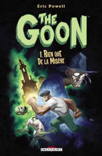
The Goon - Nothin' but Miserey REVIEW

WOW.

2 reviews in 2 days! It's like I'm on fire! After watching Flordia completely humiliate Ohio State for the National Championship tonight, I thought it would be good to read another trade. So The Goon got the nod.

This book by Eric Powell was another spectacular read! It was a very strong change of pace from last night's Loveless read, and I appreciated it even more because of it. The Goon is infused with an awesome amount of humor that is mostly self propagated due to the horror roots the concept was obviously birthed out of.

The stories were all fairly self contained and only hinted at a larger underlying theme throughout the book, but I was impressed with the concision of everything. No element in the book takes itself seriously, and that is such a fresh and different take than a lot of independent works are after. The Christmas tale was easily the most hilarious Christmas story ever, and I may have to read it yearly during the holidays. The off-the-wall shenanigans of The Goon and his pal Frankie are just what the Doctor ordered, and the occasional pseudo ads will have you in stitches!

The Art was spectacular. I'd like to compare it a bit to Jeff Smith's cartoon like renderings from Bone, but I'd have to say that Eric Powell takes the cake all the way home with him. He's got multifaceted skills that shine when he paints a beautifully painted, albeit humorous cover or takes a different approach to artistic storytelling.

THE FINAL SAY!
Well, I have to say that I was pleasantly pleased with this book and I look forward to more volumes of The Goon down the road. All in all, The rating for this book should've been a 7 out of 10 - however - one quote changed that. After coming across a large fortune in one of the stories, The Goon's sidekick Frankie belts this out, "First, I'm gonna buy a new hat. Then, a giant solid-gold statue of Rita Hayworth naked, rubbing fluffy buttery biscuits all over her nakedness!" No sir. It doesn't get much more golden than that!

Monday, January 08, 2007

New Audio Bio Posted

I've wonderful news! Someone mysteriously posted a new song on my long dormant Audio Bio! Who could it have beeeeeeeen? Maybe it was Popeye! Go check it out. Now-ish.

Sunday, January 07, 2007

Loveless: A Kin of Homecoming REVIEW

OH, SNAP!

I finally have another review of a trade. Imagine that! This one is Loveless: A Kin of Homecoming by Brian Azzarello and Marcelo Frusin. It's a great read that sets up the series very nicely and really does so in a way that makes you want to read more. I suspected that Azzarello would present it this way because I collected 100 Bullets for the first 50 issues and it was the same way.

Azzarello really socks you right in the mouth with this one, making a statement that is rarely, if ever, taken in a Civil War era story. This is an adult book, so the themes and language are very much adult. Looking at that, however, one could see that this is a story that very well could have taken place in the South after the war was over, when Reconstruction was a "goal" and "peace keeping" was a term that was loosely used in a broken society. This book also comes with a hefty point of view that the main character's brother thrusts upon us about 3/4 of the way through. This perspective makes one think for quite a while, as a war should rarely be taken for face value. Very thought provoking.

The art was very complimentary to the storytelling, much like Eduardo Risso's on 100 Bullets. The use of shadows and silhouettes is very apropos in this series, as all of the characters seem to have some ulterior motives. I can't wait to get the next trade to find out what happens next in the series.

THE FINAL SAY!
Nothing can really be better than a book that makes you think about things. This book definitely has a new, original, and subtle voice about how things might've really gone down in the South after the Union won the war. Remember, folks, reconstruction was an occupation, much like what's hapening in Iraq. Surely there were those that just wouldn't let it go, eh? This is why I have rated this book:
THE SCALES OF JUDGEMENT HAVE SPOKEN!