

 OK, here's my latest piece for this weekend's services: Matters of the Heart. We were scheduled once again to go into the Awake! Awake O, Zion! series, but last minute happenings around the church in physical and spiritual hearts prompted the changes. Usually when something happens en masse, God is communicating with you, which is why repetition is very important in matters of faith. You know "from the mouths of two or three witnesses" an' stuff. Kent had what is essentially an exhaustive "heart physical" this week and others around the church had been having heart flutters a lot, not to mention the soul (heart) issues that have come up in the last few weeks.
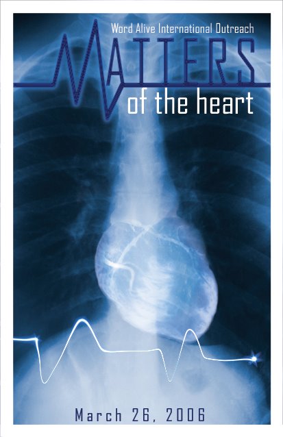
We didn't want to go all mamsy-pamsy valentine's day with the heart design, and since part of God's communication of this message was through physical tests, I decided to go with an enhanced X-Ray type image combined with a 3D image of an actual heart. I thought it was okay at that point, but one of the big sellers for me was screening an image of the vessels on the heart into the design. Making the M for Matters was a no-brainer of course, but I wanted that to look designed, so I conjured it up. The coup de grace was adding the LED ECG blip at the bottom of the image, which really made me happy.
What really took a while which this image was getting it to look great with our printer. Often times if you have differing contrasts and fades in a print, such as seen around the edges of an X-Ray for an example, the image can look great on screen and really poor printed out. I had to print about 8 copies from Photoshop before I was happy, and then when I took the image to our layout program, it printed much darker from it. So I had to print about 4 revisions from that until I finally got the finished look, and here it is, in all its gory glory.
What really took a while which this image was getting it to look great with our printer. Often times if you have differing contrasts and fades in a print, such as seen around the edges of an X-Ray for an example, the image can look great on screen and really poor printed out. I had to print about 8 copies from Photoshop before I was happy, and then when I took the image to our layout program, it printed much darker from it. So I had to print about 4 revisions from that until I finally got the finished look, and here it is, in all its gory glory.
4 comments:
I "heart" this design (heh heh). But really it is cool...I definitely like that you took it from another angle than the done-to-death valentines-y hearts and such. And I like M being part of the little squiggle-line-thingy, etc. Lookin' good, brather.
It should sufficiently make people wonder about it, anyway...
I really like the design. It's very artsy, and I agree it's better than the standard Valentine-type heart. I think this one makes "from the heart" more poignant.
Cool, glad you like it. As you can tell, you'll find an awful lot of variety up in here!
Post a Comment